The Federal election is upon us and we are bound to see a lot of noise on the internet trying to influence our vote. We expect a large variance in the usability and user experience of the tools and sites we will inevitably see. But an early leader has emerged in the shape of the Vote Compass on the ABC website.
Vote Compass is a survey tool designed to help you understand which of the three major parties (they include the Greens) most closely fits your political leanings. I am a bit of a survey junkie and Vote Compass does a number of things from a design perspective that makes it one of the best survey experiences I have had.
Controls input and reduces cognitive load
The worst surveys give you a long page of questions that become a blur and reduce the likelihood of the participant giving each question the consideration you would want them to.
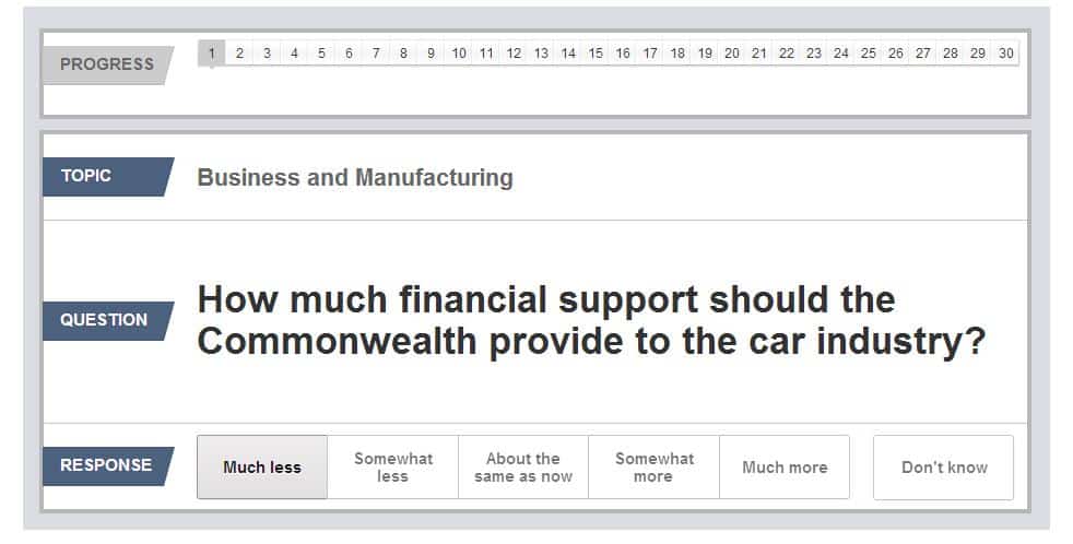
Vote Compass is, at its core, trying to help you understand where you stand on the major issues of this election. It does this by asking you to rank each of those issues individually rather than forcing you to interact with all 30 issues or even a smaller group at once. The user can focus on each issue and give it the consideration it deserves. Large text, subheadings, horizontal rules to separate each component and clear options also help users understand the question and give a considered response.
Feedback helps you understand just where you are
Vote Compass is not a short survey (about 10 minutes to complete) and it is important to have a sense of progression otherwise users may jump out before they reach the end. As the main aim of the survey is to inform and guide the user about which party most closely aligns to their own views, keeping them engaged and reassuring them about where they are in the process can be the difference between them ending the process early and completing the survey and enjoying the results.
Feedback is simple, showing users both where they are in the main process (top bar) and in the question process (numbered bar). My only criticism would be that the top bar looks a little too much like a standard navigation bar and may not adequately communicate a sense of progress.

You can also easily 'look back' at a mouse hover and check out your earlier answers in case you feel you may have answered something incorrectly.
Protects data and allows you to fix mistakes
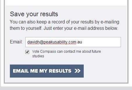
You've decided that your response to an issue was too extreme? Or not extreme enough? Vote Compass allows you to go back and change that response using either the in-page controls or more importantly the browser back button. Too many survey tools don't let you use the back button and in an unfacilitated environment (i.e. anywhere outside a lab) this is a major flaw. Once again, users may abandon a long survey if they feel they have made a catastrophic error (i.e an answer that doesn't really reflect their views) and they are blocked from correcting their mistake.
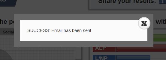
The Results page also protects user data elegantly and obviously. Emailing your results on many websites would be a cul-de-sac that would potentially have users locked out of the tool or sent to a dedicated success page that may confuse or lose some users. Vote Compass uses a simple lightbox success result to inform the user of success, and then lets the user continue to pore over his results on screen.
Elegant dashboard design
One of the real successes of the design of Vote Compass is the final results dashboard. Key data is presented simply and the key questions - where you fit in the political landscape and how much you agree with the parties - are presented clearly on the top of the page. Simple boxing is used to separate content and controls. The weighting and email controls are clearly grouped with the "political landscape" map (on left centre figure below) although I think the use of the blue on the weighting controls make them look inactive compared to lighter background inactive controls. A less passive colour than blue (such as green) might make for a better active button indicator.
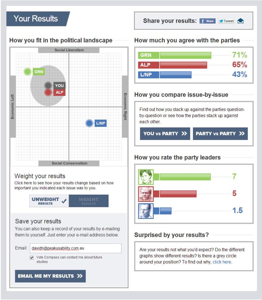
Button controls that leave the page (to a subpage or lightbox) are clearly marked with a double chevron '>>' and these pages provide a clear and consistent navigation option back to the results page (below).

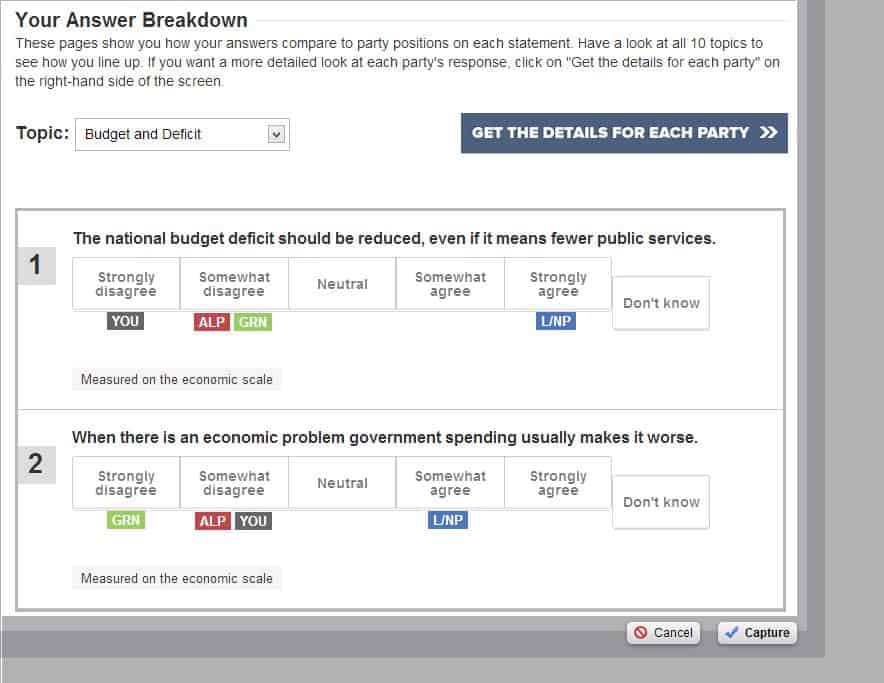
The results subpages also provide effective grouping of content to present related issues in meaningful and easy to digest ways.
This data is all just for me, right?
This is my big concern with this site and it was flagged by this clause in the demographics section of the site.
While this step is optional, it is still pretty unclear how this data will be used. Examples may alleviate some of the mistrust users may have (if they read this clause at all) and I probably would have liked to see something right up front talking about the secondary objectives of the site.
Still, the Vote Compass is a highly usable iteration of similar tools we have seen in previous elections but some of the key design elements make it (in my opinion) one of the most usable yet.
Usability tip
Gradual engagement boosts user confidence and increases conversions.
Gradual engagement (Luke Wroblewski - Sign up forms must die and Jakob Nielsen - Feature richness and user engagement) is a design approach that involves engaging the user in phases, by offering access to basic functionality in exchange for the user providing just enough information or action to allow that functionality to work. As the user progresses through the survey or application, they are rewarded with sought after information, in stages. This allows the user to become engaged and invested in the service or application and significantly increases the likelihood they will take the next step towards eventual conversion which may be registration, purchase or upgrade to a paid service. Read our full article on How gradual engagement can be used to increase conversion: learnings from Spotify Australia - June 2012.