Merry Everything! It's Christmas time and that means it's a time for giving, so we thought we should pass on a gift to you our loyal readers. We did this previously back in our 2009 article Usability tools and UX Stocking stuffers and it has been one of our most popular articles, so we thought we could pass on some of the tools, lessons and methods we have discovered that could make your testing and user research activities better in the New Year. To find out about some of our other favourite tools read the full article.
Let's start with a lesson in being accurate:
What I learned going back to UX School

A great article by Scott Berkun that reinforced to me one of the fundamentals that I, as something of an intuitive thinker, need to remind myself of when writing reports or making presentations. Objectivity requires precision and there is no excuse for sloppiness. This is the crux of the final third of the article and it stopped me short because it is such an important point that can be overlooked in the drive for brevity and quick results. Numbers are an important piece of context and your claims and findings can be picked apart and dismissed quite easily if you can't back them up.
(Photo of Scott Berkun courtesy of Randy Stewart CC (Attribution, Share Alike))
Treejack
We use Treejack all of the time. All of the time (71 testing projects over 3 years to be exact). When developing an information architecture (IA) it is the best tool we have encountered for testing the draft IA. It is easy to set up, simple for the participant to use and provides rich results including task completion and user path data. Treejack is a very pure form of testing that lets you test the menu structure in isolation of other interface design elements, content or navigational aids that may prop up a poor information architecture. If the IA tests well using this tool, no one can argue that users used other site elements to recover from poor navigation decisions. You can run tests either moderated to get qualitative feedback or just send a link to a participant for remote testing to get more quantitative results.
Treejack is part of the Optimal Workshop suite that includes Chalkmark (screen click testing as covered in our 2009 article) and OptimalSort (online card sorting) and has a range of subscription models to suit a range of needs starting from only $109 for a single month.
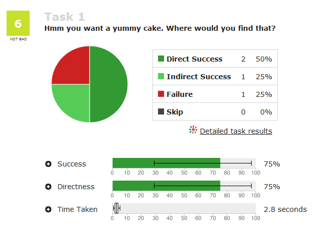
Figure 1: Example Treejack result for an individual task.
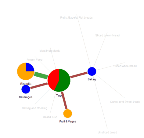
Figure 2: Example pietree for an individual task showing user paths.
Colour contrast analyser 2.2
Poor colour contrast is still one of the most common usability issues we see on sites that we test. With increasing use of smart phones and tablets to access the web, colour contrast is no longer just an issue for people with poor vision. Mobile devices are often used outside on public transport, in cars and out in the street where bright sunlight can make it difficult for users to see their screen. Colour contrast is critical for websites that are being accesses via mobile devices.
There are a number of tools that help you quickly determine if there are colour contrast issues with your web site but Vision Australia's Colour contrast analyser tool is a stand-alone executable that lets you enter a colour hex code or use the eye dropper tool to select a colour on screen and check the contrast between a foreground and background combination. So you can run it on a page, a web app or even a prototype in Photoshop.
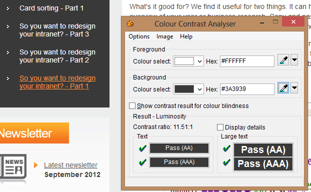
Figure 3: Select a foreground and background colour to get a quick analysis of any colour contrast issues.
Loop11 – Remote usability testing tool
Sometimes you just can't be in the same place as your users to conduct usability testing. The travel budgets might be tight or your users are too widely dispersed to get them all in one location to run a day's testing. Sometimes your focus needs to be quantitative rather than qualitative and you just need a LOT of results, something that would be too expensive and time consuming to run face to face. Sometimes you want to conduct a True Intent study to capture users coming to do an actual task on your website and track their actual behaviour in their natural environment. Loop11 can be the answer to these needs.
Why Loop11? We have found it simple to use but offers up a set of rich data about user interactions and task completion that makes it a valuable addition to anyone conducting usability testing on their site. If you want quantitative data, it does a great job of recording task completion rates and recording user journeys for specified tasks on your website. You can also capture some qualitative data and ask users open ended questions as they do the test. You can also combine it with some remote screen recording software to capture actual user behaviour.
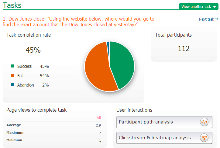
Figure 4: Example output for a particular task.
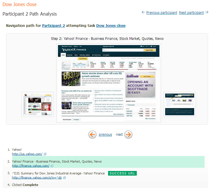
Figure 5: Example individual user path analysis.
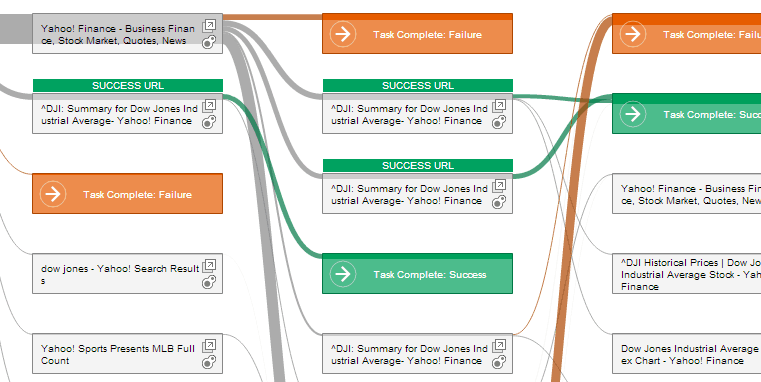
Figure 6: Example collective users' path analysis.
Join.me
Join.me is one of many screen sharing tools that were initially created to conduct online meetings or presentations but we have found it is a great tool for conducting remote moderated usability testing in conjunction with Skype or a telephone for verbal communication. What we like about this tool is it is very easy for participants to run on their computer without tech support. You can watch what your participant is doing in real time and get direct verbal feedback at the same time. The only thing you are really missing (and it is a big thing) is the user's body language and some of those more subtle verbal cues that are hard to pick up over a telephone or headset. They also have an iPad app so you can potentially run a session from a participant's iPad if you are testing in that realm. You can also combine it with a tool like Loop11 or Treejack so you can record with your favourite screen capture software and all the benefits of the data capture of the remote testing tools.

Emotion Maps
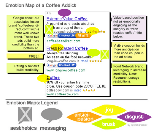
A fascinating article on optimising emotional engagement in web design from Smashing Magazine from last year. Shell Greenier argues for the necessity of measuring brand engagement on websites at the emotional level and offers an intriguing way to measure and display that engagement, emotion maps.
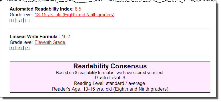
Readability calculator
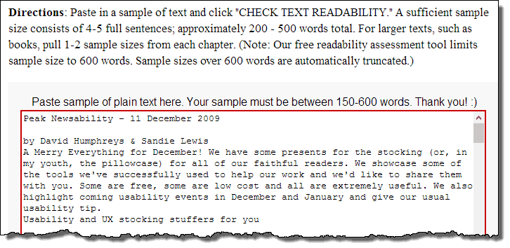
A significant number of Australians (17%) have very poor literacy (ABS 2006) and websites aimed at the general public should generally write content targeted at a 6th grader level. But how can you tell? Use the Free Readability Consensus Calculator. This tool lets you plug a block of text into a page and then assesses that text against 7 different readability formulas and grades your page against them. This can help you, scientifically, assess content on your site and have a tool that might help you reign in unruly content owners.
So hopefully that has whet your appetite and given you some food for thought for 2013. If this hasn't turned out to be enough look for more tools and inspiration at UXMastery.comand if you haven't read our other article, be sure to check out our 2009 article Usability tools and UX Stocking stuffers which includes many more tools which we still use regularly.
Usability tip
Don't conduct usability testing with family, friends & colleagues.
With shrinking budgets and time constraints you may be tempted to conducting usability testing using your friends, family or colleagues. While testing with anyone is always better than no testing at all, there are a few key issues testing with family, friends and colleagues and as such, we don't generally recommend it:
- Friends, family or colleagues are not likely to match your target demographic. e.g. if you are designing a website targeted at first home buyers, testing with your mum is not going to give you a good understanding of how first home buyers might use a website. Unless your friends or family members closely fit this demographic your results are not likely to be representative of the audience group.
- Friends and family tend to be over favourable and less critical "That's lovely dear" (or overly critical for some families) as they don't want to offend you and criticise your little baby. They may also be a bit embarrassed that they can't do something and not communicate points of confusion and be less honest.
- Lack of motivation - whenever we ask anyone to give up their time freely for more than 10-15 min the results are variable as people rush through things as they are not as motivated to help. When being paid, participants are usually much more motivated to complete the activity as most users feel they need to earn their incentive.
- Close family members and work colleagues in particular, may have a greater subject knowledge and level of familiarity with the site or system you are testing and aren't going to be a good indication of what real users will do.
So if you have to, conduct testing with friends, family or colleagues but if you can afford it, take the time to recruit participants that fit your target demographic and consider using a professional market research/recruitment firm to test with real representative users.