Recently I was asked to provide my thoughts on how to categorise recommendations from IA testing and evaluation. In my view, to categorise the recommendations, we need to first understand the underlying problem or issue.
One of the challenges we find in IA testing for our clients is how to interpret results and determine what the actual issues are after IA testing. I find that many IA/UX designers doing IA testing tend to focus on analysing the results on a task-by-task basis. However, often it may be an issue with one menu label that causes participants to fail several tasks.
When doing IA testing, I typically use a tool by Optimal Workshop called Treejack. It is one of my favourite tools for IA testing as it enables us to test the IA in isolation of any content or UI design that might otherwise prop up a poor information architecture. It also provides great visualisations of test results such as pietrees which make it easy to see collectively test participants' chosen pathways.
Usually, I try to categorise the issue in one of two ways - labelling issue or structure issue. The examples shown below are from an IA test we conducted on a business assistance website.
1) A LABELLING ISSUE
This is where the menu label or terminology doesn’t resonate with users or align with their mental model. This is often the case when a user chooses the correct pathway but then either goes back up a level or chooses a wrong pathway as the label on the correct pathway doesn’t meet their expectations.
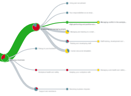
In the Treejack pie tree Figure 1 below, the chunky green line shows that for the most part, users chose the correct pathway (first click to the correct section). However, after that, it seems likely that the proposed menu label did not resonate with users as they went all over the place choosing a variety of incorrect grey pathways, causing most to fail.

2) A STRUCTURE ISSUE
This is where something is located in one section, but users expect or associate that content or feature with another section e.g. they associate ‘How to write a marketing plan’ with ‘Starting a new business’ as they think this is something you do when you start a business but the content may have been placed in the ‘Running a business’ section as it is actually something businesses should do every year.
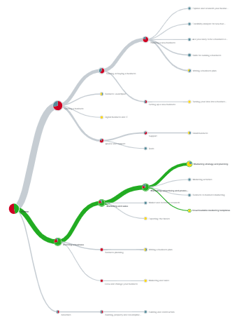
In the Treejack pie tree Figure 2 below, the chunky grey line shows that a greater proportion of users chose the incorrect pathway and then went all over the place (as they were in the wrong section). For those users who chose the correct green pathway, many more successfully navigated to the correct location.

The question then remains, how do you determine if it is a labelling or structure issue?
If you only have remote test data to analyse, you basically have to be a bit of a detective and try to work out where users veered off course and took an incorrect path (i.e. where the IA design failed) and try to deduce why.
I typically look at the data to see how many people went down different pathways and where they went wrong. Was it their first click (possibly a structure issue assuming the label is reasonably clear as in Figure 2 above) or was it their third click 3 levels down when participants diverged and chose a wide range of pathways (likely a labelling issue if they mostly navigated to the right area but had no idea which menu link to pick as in Figure 1 above).
Often it can be hard to determine when just analysing remote test data. For this reason, I often like to run at least a couple of moderated IA test sessions as well. The qualitative insights help me understand and explain the data. For instance, when testing the business assistance website, participants told me that they expected you would write a marketing plan only when you start a business which is how I knew it was a structure issue.
Once you are clear about what the issue is you can then determine if you need to move the content or feature to another section, try a new menu label or add a crosslink (which I only recommend sparingly, e.g. if it is a structure issue and half participants went to one section and the other half went to another section).
I typically then prioritise the issue based on the impact on the user and persistence. Did it cause participants to fail one task or several tasks, and did many participants experience the issue? For instance, I once tested a site which had 'Resources' at the top menu level. This single label caused many users to fail many tasks as they navigated to this section to complete almost half of the tasks. The label was just too broad and encompassing. It was a persistent and high-severity issue.
So to answer the question of how to categorise recommendations, first I categorise the issue type and then the severity.
Typically, in our UX consulting firm, PeakXD, we meet with our stakeholders and clients after IA testing and walkthrough the ‘critical’ issues first and the likely cause to collaboratively discuss changes that will improve the IA and UX. If we have time, we then discuss the ‘major’ severity issues as well.
If we find labelling issues, especially at higher levels in the menu, we typically recommend testing the new labels (as they may not test any better). This will give the client the confidence to implement.
To learn more about IA design testing including methods such as card sorting, IA design and testing, check out our UX courses at www.peakxd.com.au/training