*This article has been updated since it was originally published in 2013*
Get your user research into shape with triangulation
Research is not unlike the computer science concept of 'garbage in, garbage out'. If you don't design or conduct it well, it's difficult to have confidence in your results. This article talks about rigour in research – specifically, good design principles to achieve rigorous research. For those working in the UX field, having a solid understanding of research methods can help you:
- design (or commission) UX testing studies where you have confidence in the results;
- justify your research if you are ever challenged on your UX testing results (which is bound to happen at least once in your UX career!).
Research ain't flawless
For those who get up-close and personal with usability evaluation, you know it’s both an art and a science.
Yes, there is no escaping it - you need a healthy dose of science (well, social science) techniques: sampling considerations; question wording for construct validity; minimising biases; interpreting statistics… and so on!
However, the artistry is equally important. This is most apparent in qualitative research: relaxing participants during sessions; eliciting information on difficult topics; knowing when to explore (or 'probe') deeper; the intuition and insight of qualitative analysis etc. Even crafting meaningful survey questions and analysis still requires an 'artist's touch'.
- Despite this blend of science and artistry, research is often judged by scientific standards. You’ve probably heard things like: "This is only a small sample size, how can you be sure this research is representative?"; or
- "What users say and what they do are two different things, this research cannot be trusted!".
This scepticism surrounding research is not surprising given that it is widely documented that research is prone to bias. Social scientists have identified countless examples of bias in research - measurement bias, procedural bias, response bias, and confirmation bias to name just a few. As practitioners, we also know UX studies are influenced by the time and budget constraints we are under.
The end goal
Validity and reliability are the two traditional goals you seek in your research, to ensure that it is indeed 'rigorous'. These are articulated and applied differently depending on your research (qualitative versus quantitative*):
| Qualitative | Quantitative | The Pragmatists Definition |
|---|---|---|
| Credibility | Internal validity | Is what we're intending to measure actually being measured? |
| Transferability | External validity | Is what we're actually measuring applicable to the real world? |
| Dependability | Reliability | If we did this study again, would we get the same results? |
Adapted from Hughes, 1999.
(*Need a refresher on the difference between qualitative versus quantitative research?)
Introducing… triangulation!
Triangulation is a fantastic research approach which can tackle all of the above. It's certainly not the 'holy grail', or even the only way to go about achieving validity and reliability in your research, but it certainly is a good place to start - and it's not rocket science! I've provided a few different definitions of triangulation depending on your 'state-of-mind' today (... or your preferred learning style):
| Metaphoric definition | Triangulation draws on a metaphor from surveying and navigation. Essentially, using two known points (or two pieces of data) you can determine the unknown point (your research findings), as in a 'triangle'. |
|---|---|
| Classic academic definition | Cohen and Manion (1986) are traditionally credited with this 'classic' definition: Triangulation is an 'attempt to map out, or explain more fully, the richness and complexity of human behaviour by studying it from more than one standpoint.' |
| Conceptual thinkers definition | For those conceptual thinkers out there, triangulation is like a filtering process – chuck everything you can get your hands on into the filter, and ain't it grand when you still come to the same conclusion – OR it broadens your perspective. |
| Pragmatists definition | It's your concept of proof (…yes a bit like proving your case). We know our results are 'right' (or 'true') because of THIS, and THIS, and THIS. |
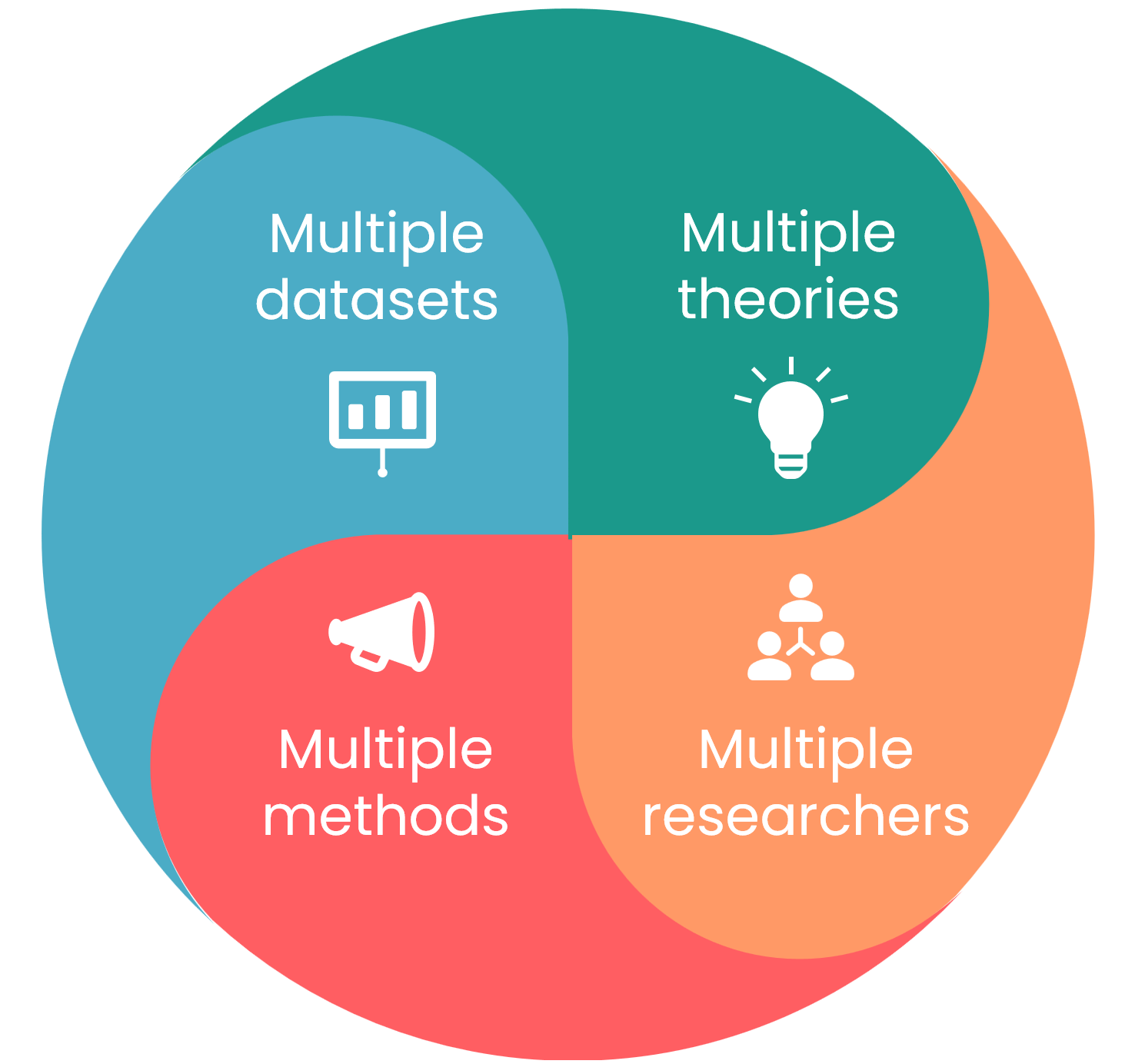
The most obvious form of triangulation is combining different research methods, such as a survey together with some qualitative interviews. However, here are some other ways to think about triangulation:

- Multiple methods: Yes - combining a quantitative and qualitative approach is ideal. But budget or time withstanding, you can also think about ways to triangulate 'within method'. For example, testing participants in the lab and in 'the wild' (in their natural setting). Within each session, you can use a behavioural observation checklist, qualitative interviewing techniques, and top it off with a survey on their understanding of the site layout.
- Multiple datasets: Think about gathering data from different sources, contexts and points in time. At PeakXD, we like to start a project looking at what's already available - web analytics, past customer research, market research or any other primary research that can tell us about the user and how they interact with a site. Within a test session, a pre- and post- questionnaire would also qualify as triangulation; or in a project - conducting research in a phased approach.
- Multiple researchers: Two heads are better than one, and it is certainly a form of triangulation. There are more rigorous ways to apply this, however. For example, using a convergent interviewing technique, where different researchers interview participants in unstructured interviews and continuously confer notes on similarity of themes. Or setting up two 'comparative' samples - with different researchers working on each, and comparing data only at the analysis stage.
- Multiple theories: We all tend to come to studies with 'theories' about usability - consciously or unconsciously; an embodiment of our practitioner experience and professional learning. It's often useful to make this process explicit (e.g. writing down your hypotheses before you start), but also to draw on multiple well-established theories in the field to use as a 'lens' to review your data. For example, if you were doing a study on user experience, you could compare your data through the lens of Peter Morville's user experience honeycomb, as well as Nielsen’s usability heuristics. Another useful approach is to include an interdisciplinary team on your project - someone with a technical IT background or someone with a social science background; they'll definitely bring multiple theories to the forefront!
The opportunities for triangulation are endless … it’s part of what makes research exciting!
Triangulation in practice
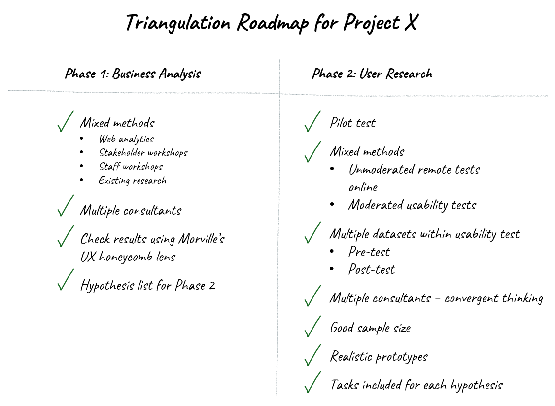
Sounds great but don't know where to start? We recommend you make this process explicit – draw a triangulation roadmap for your project. You might be surprised at how much 'triangulation' is built into the process already.
We've also developed a useful 'design guideline' that can assist in building triangulation into your research:
| Goals | Design Guidelines for Applying Triangulation |
|---|---|
| Credibility / Internal Validity |
|
| Transferability / External Validity |
|
| Dependability / Reliability |
|

Be aware!
Triangulation isn’t foolproof - social scientists have identified a bias just for triangulation – confirmation bias. This is the tendency to seek data that confirms existing results or hypotheses, and ignore data that is disconfirming. Classic case in point: conducting a quantitative study to 'back-up' your qualitative research findings. If this is what the results say that’s fine, but it's biased if you start with this intent only. It's important to keep in mind:
- Triangulation is not just about getting datasets to 'agree'. It is about a greater, richer understanding of an often complex construct you are studying; particularly 'user experience' which can only be understood indirectly given its intangible nature. Triangulation can broaden your understanding, and yes sometimes correct your understanding where results are disconfirming;
- If you really want to test whether datasets 'agree', then make sure questions are structured similarly across methods, and tested within a similar period of time;
- Build this 'be aware' note into your triangulation roadmap!
In summary
- User research is both an art and science – but we can try to achieve acceptable levels of confidence in our research ('rigour') irrespective of whether we lean more to the artist or scientist variety (or have a large or small research budget and timeline!).
- Achieving rigour (confidence) in our research is about trying to minimise bias, and maximising the validity and reliability of our research.
- Triangulation helps us achieve 'rigour'; it involves using multiple perspectives (methods, data-points, researchers or theories) to confirm (or disconfirm) our end insights.
- Try to make this process explicit, use the triangulation design guideline and build a triangulation roadmap for your next usability research project!
References
Hughes, M (1999). Rigor in usability testing. Technical Communication, 46(4), pp. 488-576.
Olsen, W (2004). Triangulation in social research: Qualitative and quantitative methods can really be mixed.
Turner, P & Turner, S (2008). Triangulation in practice. Proceedings of the 11th Annual International Workshop on Presence.