This month David and Tania look at common themes that affect the usability of council websites, we discuss microsites, and keep you up-to-date with upcoming usability events.
Usability of Council websites
Common navigation and information architecture issues in local government websites
Getting the information architecture (IA) and navigation design right can be a significant factor in users being able to complete tasks and have a satisfactory experience on your website.
We have recently worked on a number of local government or council websites and have noted consistent themes and issues regarding navigation design and information architecture (IA), some of which have relevance to all types of websites.
This article explores the common themes and issues which affect the usability of council websites.
Websites are an important tool for local governments to inform their constituents of council services, laws and bylaws and infrastructure affecting their local area. They can also be a cost effective service delivery mechanism, with the average cost of servicing customers generally significantly lower than other offline channels such as call centres and customer service centres. However, many council web teams are poorly funded and not well resourced. Some councils do not appreciate the potential cost savings and benefits associated with an effective online channel for customer service delivery.
In the last 18 months (from the date this article was written), we have usability tested and/or helped redesign three local government websites in Queensland, all very different:
- Brisbane City Council - a large metropolitan council covering Brisbane CBD and suburbs.
- Cairns Regional Council - a regional council in the north of Queensland.
- a SE Queensland council covering both city and regional areas.
So what have we learnt working with different local government websites? Here are some of the common themes, issues and guidelines for local government websites.
Audience groups and user needs tend to be consistent across councils
At a recent local government forum I attended, the question was asked by one council "Who are our target customers?" From our experience working with council websites, the primary target audiences are generally:
- Residents (ratepayers and renters)
- Businesses
- Tourists/visitors
Secondary audiences typically include:
- Community groups and not-for-profit organisations
- Suppliers to councils
- Building / infrastructure sector - property developers, urban planners, environmental consultants, plumbers etc
Whilst councils have different internal structures and different laws and services, the needs or goals of visitors to council websites appears to be fairly consistent. The same keywords and topics typically appear in internal search engines. Generally speaking, broad user goals include:
- Access to Council services and facilities - rubbish collection, libraries, pools etc
- Information about infrastructure and planning changes to their local area
- Access to Council bylaws, permits and registrations; and
- The ability to pay rates and use other online facilities provided by Council.
Users tend to behave online consistently across different regions
Regardless of what local government area they live or work in, including both metropolitan and regional areas, users tend to have similar 'mental models' about how council information should be structured. Navigation behaviour and keywords they search for tend to be consistent. This has been documented by others such as Jakob Nielsen in his article "Location is Irrelevant for Usability Studies" where he notes "You get the same insights regardless of where you conduct user testing".
Audience based navigation doesn't work very well for council websites
Users typically have a particular task they are trying to achieve and when they arrive at a council website, they scan for a trigger word or keyword that matches that particular online goal. As such, users don't always identify with audience based groupings often found on Council websites such as 'Residents' or 'Visitors'. Content is often applicable to multiple audience groups but often can only be found in one area of the site e.g. 'What's on' is applicable to both residents and visitors. Council menu structures that mix schema also create significant usability problems for users e.g. topic based menu links with audience based menu links. For instance if I am a homeowner wanting to extend my house I could go to either a 'For Residents' or 'Planning & Development' menu link as they are not mutually exclusive.
Topic based navigation works for council websites
In card sorting (discussed in detail in a previous newsletter) for BCC and to a lesser extent Cairns City Council, users showed a preference for topic based groupings of content. Both IAs consistently tested very well with high task completion rates indicating that users were able to identify with the topic based headings used.
Table 1 - The new top level IAs for Brisbane & Cairns Councils
| Brisbane City Council IA | Cairns Regional Council IA |
|---|---|
| About Council | About our region |
| Planning & building | About the council |
| Traffic & transport | Planning, Infrastructure & building |
| Environment & waste | Environment water & waste |
| Community support | Community support |
| Facilities & recreation | Facilities & recreation |
| Laws & permits | Laws, regulations & permits |
| Payments & e-services | Online services & payments |
The main differences between the two IAs are the result of different online strategies and site purposes. For example, Brisbane has segmented all of its lifestyle, tourism and city living information off to the ourbrisbane.com website while Cairns, with a strong tourism focus, retains that information on their site. Brisbane also has a stronger need for traffic and transport information, which is a much bigger issue in Brisbane.
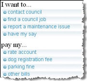
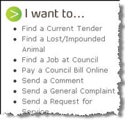
Balance with task based links from the home pageThe topic based IA can be balanced by task based in-page navigation on the homepage. These can steer users straight to information, forms or processes deep within the site for those most commonly performed tasks such as paying rates, reporting maintenance issues and complaining or having a say about something. In testing of one council site (before their redesign), we found that users relied on these task based links heavily, although the previous poor IA may have encouraged them to use the task based navigation.


Figures 1 and 2 - Task based navigation on Brisbane City Council home page and Cairns Regional Council home page
Design of index and navigation pages (landing pages) is important
Landing pages should play an important role in helping users navigate to deeper content pages which contain the information they are seeking but many of the council landing or navigation we tested were not effective.
Landing pages should provide users a quick and clear indication of what sort of information they will find in that section of the site. Their design is important and users need to be supported with contextual information to help decision making.
- One council site we tested completely overwhelmed users with the number of links and content areas on some landing pages. Some users actually failed tasks when presented with a landing page that just provided a massive list of poorly categorised links.
- Another council site we tested saw a different problem with most 2nd level index pages not having any in-page links at all in the content area, relying on the left navigation menu to guide users to the content. The content on these pages was often superfluous and did not help users navigate to the content they were seeking.
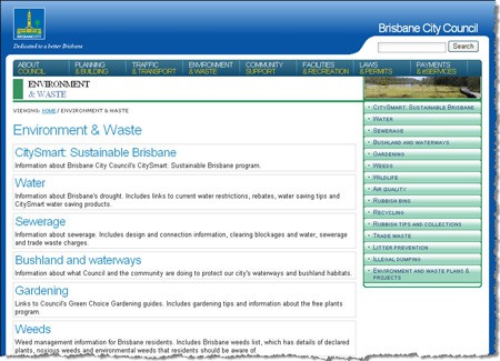
The recently launched Brisbane City Council website has addressed this issue and now provides an excellent example of an effective landing page. Key user friendly keywords are used for headings and each heading is supported by contextual information to help users decide if that is the correct link they want to choose. This landing page also accommodates "Menu dominant" users as all the key information can also be accessed on via the second level menu.

Figure 3 - Good example of an effective landing page on Brisbane City Council website
Unclear and ambiguous terminology (jargon) is common and should be avoided, especially in menu labels and links
This is a common problem on council websites and it must be pointed out that users are not subject matter experts like the content creators. All council websites we have tested have had this problem, especially in highly technical areas like planning and development information or building regulations. Many users of this content are not technically minded (home renovators, building and development company support staff or small business people) and using highly technical terms as page titles and links just makes it harder to find. E.g. 'waste management facilities' instead of 'rubbish tips'.
Having a large number of dedicated sub-sites should be avoided as it only confuses users
It is our view that a sub-site should only exist if it has as a distinct audience or site purpose such as a tourism website or portal with different goals and branding needs. When testing council websites we have noted that councils often have a number of sub-sites that sometimes reflect different business units. However, these often include core services that visitors expect to find on the main council website. For instance, in the old Brisbane City Council website, a lot of key water related information was located in the Brisbane Water website which had a different look and feel and navigation model which caused confusion for users. The recently launched Brisbane City Council website now appears to fully integrate all water related content into the main council website.
In another example, testing with another council website required users searching for regulations covering clipping a neighbour's overhanging tree to go to a separately branded website. Needless to say, 100% of users failed this task.
Summary - what does it mean for all web designers
To summarise, we think there are lessons for all web teams that can be learnt from the usability work done with local council websites. There are common themes and issues that exist across all council websites and indeed many of our other clients' websites. Key lessons and guidelines for all web designers include:
- Audience groups and user needs tend to be consistent across councils. This is also true for equivalent government agencies in each state.
- Users tend to behave online consistently across different regions.
- Audience based navigation doesn't work very well for council websites (but this may not be true for other types of websites).
- Consider alternative navigation schema on your home page e.g. in-page task based links if you have a topic based menu.
- Use index and navigation pages (landing pages) that include clear in-page links with supporting contextual information.
- Unclear and ambiguous terminology (jargon) is common and should be avoided, especially in menu labels and links.
- Avoid the creation of dedicated sub-sites unless they have a specific or unique site purpose, audience and branding requirement.
If you are interested in us helping with your council information architecture, contact us.
Usability tip
Too many sites can dilute your brand and confuse your users.
There is no hard and fast rule governing how many sites and micro-sites your organisation or company should allow. It is sometimes important to give a product or issue pride of place with its own domain, branding and visual design. Too often though we have seen users confused by the diverse range of sites that are published by a single organisation with no obvious relationship between them. They get lost in the different menu structures, page layouts and visual designs. We've heard the words "How did I get here?" more than once.
Try to minimise the number of sites to those that truly have a different purpose, different audience or need some brand differentiation and make sure that they contain obvious and persistent links back to the parent website. Where possible use a visual design that is thematically similar to the parent to keep users comfortable knowing that they are still in a Company XYZ website.
If you are getting a lot of requests for micro-sites or brand differentiation it may be an indicator that the business is not confident in the ability of the parent website to deliver its message effectively. Perhaps it is time to start exploring why they want a different site. Maybe it's just not working.